Microsoft isn’t the same company it was 10, or even 5 years ago

I was at lunch today with Chris Messina and some others from Vidoop, and somehow as often happens with me, we got into a very interesting discussion about the way Microsoft does things. In particular, Chris indicated some frustration with a lack of traction that he’s gotten with Microsoft in the past regarding technologies that he and others advocate. He cited a long string of press releases and public appearances supporting the technologies that will make up the open web and an equally long string of failures to deliver any level of support in actual code. He’s definitely right–what gives?

Being the Microsoft fanboi devil’s advocate that I am, I claimed that the Microsoft that exists today isn’t the same Microsoft as we all know from 10 years ago (or even 5). I admit that there are a tremendous number of things that Microsoft doesn’t yet demonstrate a deep organizational understanding for, including Open Source, Open Standards, the consumer Internet, etc., but the one thing that I do know from my 7.5 years with the company is that they’re nothing if not self-critical, especially when they’re not winning the game.

I challenged Chris to name some things that he thinks he’s learned about Microsoft over the last few years and give me a chance to argue that some of them have changed. He threatened graciously offered to write up a blog post with at least 5 misguided things of which he would accuse Microsoft along with examples of how they could prove him wrong by speaking with code. I think that sounds like a great idea. I can’t wait for the conversation to begin!

New York Times: Noah's Art

The June 1 issue of the New York Times included the 11th installment of their twice-annual Op-ed Puzzle. Sort of a miniature paper-based puzzle hunt, you first solve several themed puzzles, and then roll all of their answers together in one final metapuzzle.

The series is produced by the trio of former Games Magazine editors who make up puzzle construction company “Puzzability“, Amy Goldstein, Mike Shenk and Robert Leighton.

Talk about it in the forums at: http://www.puzzlehunters.com/forum/viewtopic.php?f=29&t=16

WordPress upgrade complete!

I just upgraded to WordPress 2.5.1 from 2.3.3. It didn’t go nearly as smoothly as I wished. After my first upgrade according to the upgrade instructions, all the site would do is return completely empty pages. I reverted, exported my previous blog contents, created a completely empty new database, and reimported everything here. Now I have a whole lot of work to do to get my site themed and the config tweaked back to doing what it did before. Not to mention replacing all my previous plug-ins. I’m not amused. I’m also not motivated to switch to MovableType just yet.

The Puzzle Hunters dream

I’m happy to see that the forums are still active after the first couple of weeks that this site is in existence. That’s a very good sign.

Go visit the forums now if you haven’t in a while: http://www.puzzlehunters.com/forum/

But there’s still a tremendous amount of work to do before we puzzle-people can sleep easy at night knowing that we know where to go on the Internet to interact with like-minded people!
The keys to building a vibrant community are attracting new people all the time, and keeping people who already know about the community coming back. Right now, it’s easy to visit the site once and never come back.

To that end, I’ve been thinking about where we should take Puzzle Hunters, and I have some ideas that I’d like to run by you.

First, I’d like to develop the blog on the front page into the best source of puzzle-related news that’s available on the entire web. In order to do this, I’d appreciate your help.

Here are some ideas to get you started:

  • Send me leads on puzzle news stories.
  • If you know of some places on the web that I should check out, post a comment here or start a thread in the forums.
  • If you have an upcoming event, however distant, or a review of an existing event, post it (or at least a link to it) in the forums.
  • Let me know if we’re missing a forum that we really need.
  • Design a better skin for the site than the WordPress/phpbb deafults.
  • Volunteer to be a contributing author on the blog.

Welcome, Puzzle Hunters!

Welcome to Puzzle Hunters! This is your place for news, announcements, and discussion on puzzle events everywhere.

Please subscribe to this blog to stay informed, and check out the forums at http://www.puzzlehunters.com/forum.

Puzzle people unite!

Hey, all, I’ve been meaning to start down the road toward building up a community of all you puzzle people out there, whether you call your puzzle addiction Puzzle Hunt, Mystery Hunt, Treasure Hunt, Games Magazine, or The Game, I’ve set up exactly the site for you: http://www.puzzlehunters.com.

Please check it out and give me the frankest feedback you can on what’s missing. I also admit that I’m not 100% sure how to quickly get to critical mass, and, once I’m there, how to sustain it. Your thoughts on that also appreciated.

Universal OpenID Button

Following Clickpass‘s lead, there are 3 key scenarios that a Universal OpenID Button needs to enable in order to gain widespread use on the web: 1) new user sign up, 2) existing user sign in, and 3) merge existing Identity 1.0 user with a new or existing OpenID user.

Despite the existing best practices for all 3 requirements (and many more), as you look around the web you’ll find implementations that demonstrate dozens of completely different takes on what it means to be an OpenID Relyer. One very important side effect of Clickpass’s approach is that their button essentially comes along with mandatory best practices. That is, any site which chooses to implement the Clickpass button will behave nearly identically to any other site that chooses to implement the button.

By necessity, this minimum set of behaviors will be very small–sites probably wouldn’t be as quick to get on board with the button if full-on AX support is required, for example. But the clear guidance that such a button program would provide would be invaluable in helping site owners understand what work goes into getting started with OpenID and doing it right.

Just to throw out a strawman to get some conversation going, I’d say that a Universal OpenID Button should start by supporting the three scenarios I called out above plus it should help users get their very first OpenID if they don’t already have one. This last bit might seem like it diverges from Clickpass, or even from the current practice of each site owner choosing which OpenID provider(s) to refer users to for whatever arbitrary reasons they like, but it doesn’t have to. Site owners could still choose to send their users to myVidoop.com or MyOpenID.com or Clickpass in the interest of either themselves or their users. Or if they don’t want to choose favorites, they could send their users to the OpenID Foundation for help in choosing a provider.

By the way, next post will be the one where I start going into deeper technical detail on how I think we can pull this off.

Heading off button proliferation in OpenID

The great OpenID usability work that Clickpass recently launched and the reactions that followed have induced me to spend some time thinking about what this all means for OpenID.

The first conclusion that I reach is that Clickpass-style single-click single sign-on is almost inevitably the future of OpenID–it makes it trivially simple for even the least savvy user to understand how to sign up and how to sign in. And interestingly, Clickpass is not the first company to realize this–they’re simply the first company to tell a story that causes this to stand out to me as a particularly brilliant feature. Yahoo provides an OpenID button (whose obnoxiously typical terms of use require a 25 pixel moat around it), and Microsoft’s Passport Live ID has employed a button for approaching a decade.

The problem with all of these buttons is that there are bound to be so many of them. As in my article on annoying social bookmark icons, I can already begin to imagine the OpenID button area that we’re soon to start seeing pop up (and there are already some examples of poor re-inventions of the button-area):

openid_buttons

The right way to solve this problem is for us all to agree right up front on a way for each publisher to only have only one button–an OpenID button. Clickpass has an implementation that’s more than halfway there, and I think that one possible future would consist of Clickpass having opened up their button to the point that a user who already has any other OpenID gets a first-class experience with the Clickpass button. I believe that Clickpass won’t ultimately thrive without being as open as possible and collaborating closely with the OpenID community, but from my brief conversations with Peter Nixey, it seems clear to me that they get that.

Another possible future (which is not mutually exclusive with the previous one) consists of the OpenID community coming together to build an OpenID button that does things right. Clickpass would certainly still have a business in providing added value over the community-owned OpenID button, but the community button would provide a non-proprietary alternative for those site owners who value openness over features.

I’ll follow this article up shortly with a description of the minimum set of features that would be required for a community button to take off.

IE8 vs annoying social bookmark icons

Microsoft released Beta 1 of Internet Explorer 8 during MIX08. They’ve done some exceptional work during the 15+ months since IE7 shipped (passes ACID2 out of the box, implements some neat new JavaScript features, has moved the IE Dev Toolbar developer tools into the browser, and too many other things to list here).

My personal favorite feature is a thing that Microsoft calls “Activities“.

IE8′s web site describes Activities as:

contextual services that provide quick access to external services from any webpage. Activities typically involve one of two types of actions:

  • “Look up” information related to data in the current webpage
  • “Send” content from the current webpage to another application

They can be discovered and installed from anywhere on the web much like the search providers that plug into the search box in the upper right corner of any modern web browser.
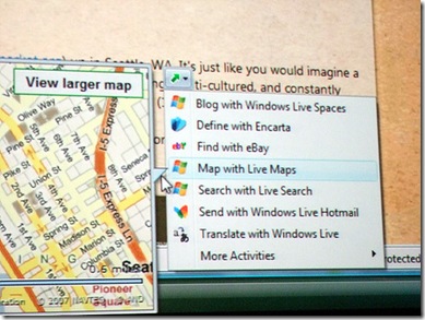
photo by flickr user Channy Yun

To understand why this is my favorite IE8 feature, and further why I believe that every major browser will end up adopting this idea, let’s take a look at one of the scourges of the modern social internet–the social bookmarking icon collection:

image

This incomprehensible clutter is found below many news and blog articles and is supposed to help you bookmark the article for future review or to share it with your friends.

Unfortunately, if you didn’t already know that, there’s very little way for you to figure it out for yourself. And even worse, unless you’re so familiar with at least one of the sites that you know its icon by sight, you’ll never be able to pick which of the 26 little buggers to click on.

If you’re an avid social bookmarking user, you can probably find your favorite site’s icon somewhere in that mess. But if you’re an avid social bookmarking user, you probably already have a browser plug-in or bookmarklet that can do the same task–even on sites with fewer (or no) social bookmarking icons.

So it’s a polychromatic eyesore, and it isn’t helpful whether you know what you’re doing or not.

Before we get back to talking about Activities in IE8, I’ll point out that there has been some progress lately on consolidating the hideous collections into a single button and letting a central site worry about making sure everyone’s favorite bookmarking sites are supported. http://www.addthis.com is the first such site that I remember hearing about, and http://www.sharethis.com is doing some interesting work in the consolidation arena, having created an icon that they encourage all social bookmark cosolidators to use. The icon is apparently gaining some traction, judging by Google’s use of it on Google Shared Stuff.

Activities fit into this whole thing by giving each user the ability to tweak their browser’s context menu to include all of the icons for activities that they consider useful while not cluttering it up with dozens of icons for sites that they don’t care about. As you can see from the samples on the list in the picture above, there is a variety of things that activities can do beyond simply sharing a bookmark. The IE8 Service Gallery groups them into activites that Blog, Define, Find, Lookup, Map, Send, Share, and Translate, but the developer documentation leaves room for making up your own activity types.

It’s also incredibly easy to create new activities. You simply create an XML file that describes which URL to use depending on whether the user has chosen a page, selected some text, or right-clicked a link. You simply tell the Activity what extra info to send along to the URL, and off you go.

Far easier than getting all the news and blog sites or even just sharethis.com to include icons for all your favorite sites, and more in your control.
Vidoop, the military, and national ID cards

Marshall Kirkpatrick’s claim that Vidoop is “a company made up largely of engineers with military backgrounds” makes for a great thriller plot, especially in the context of his National ID discussion over at ReadWriteWeb. That description, however, doesn’t reflect the Vidoop that I know. One of our developers was a civilian researcher at the Naval Research Labs for a couple of years, and one of our developers was in the Army long enough to spend some time in Afghanistan. That’s the extent of our military ties.

That said, there are some very interesting things to think about elsewhere in Marshall’s post. Like him, I’m not excited about being issued a National ID, let alone the prospect of having my OpenID inseparably tied to it. That just doesn’t make sense. I shouldn’t need a National ID to have a flickr account, and any such ID shouldn’t be associated with my search engine use.

But there are scenarios where being able to convey certain institutionally-verified claims about my identity online would be useful. For example, I miss certain wines from Washington State’s wine country because the State of Oklahoma won’t let me have wine shipped here. Perhaps it’s because they don’t want minors to have access to alcohol through the mail, or more likely it’s because they don’t want alcohol in the state for which they didn’t get their tax money. Either way, being able to prove that I’m old enough or that I paid appropriate taxes on the transaction are things that technology could enable in the near future, and there’s absolutely no reason that OpenID couldn’t be one of the protocols involved at the time I prove such things.

Remember that OpenID is all about putting control of your online identity in your very own hands, and there are built-in controls to make sure it will always continue to be that way. (The strongest such control is that anyone who doesn’t like the way the current Identity Providers work can always run their own Provider.)

Your identity shouldn’t do things that you don’t want it to do, but it should certainly be able to do all of the things that you do want it to do. And with OpenID each of us has the ability to want our OpenID to do different things.