The great OpenID usability work that Clickpass recently launched and the reactions that followed have induced me to spend some time thinking about what this all means for OpenID.
The first conclusion that I reach is that Clickpass-style single-click single sign-on is almost inevitably the future of OpenID–it makes it trivially simple for even the least savvy user to understand how to sign up and how to sign in. And interestingly, Clickpass is not the first company to realize this–they’re simply the first company to tell a story that causes this to stand out to me as a particularly brilliant feature. Yahoo provides an OpenID button (whose obnoxiously typical terms of use require a 25 pixel moat around it), and Microsoft’s Passport Live ID has employed a button for approaching a decade.
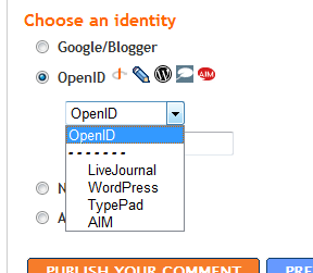
The problem with all of these buttons is that there are bound to be so many of them. As in my article on annoying social bookmark icons, I can already begin to imagine the OpenID button area that we’re soon to start seeing pop up (and there are already some examples of poor re-inventions of the button-area):
The right way to solve this problem is for us all to agree right up front on a way for each publisher to only have only one button–an OpenID button. Clickpass has an implementation that’s more than halfway there, and I think that one possible future would consist of Clickpass having opened up their button to the point that a user who already has any other OpenID gets a first-class experience with the Clickpass button. I believe that Clickpass won’t ultimately thrive without being as open as possible and collaborating closely with the OpenID community, but from my brief conversations with Peter Nixey, it seems clear to me that they get that.
Another possible future (which is not mutually exclusive with the previous one) consists of the OpenID community coming together to build an OpenID button that does things right. Clickpass would certainly still have a business in providing added value over the community-owned OpenID button, but the community button would provide a non-proprietary alternative for those site owners who value openness over features.
I’ll follow this article up shortly with a description of the minimum set of features that would be required for a community button to take off.
2 Comments
Hi Scott,
Good post and as you mentioned we’re looking at exactly that – the best way in which we can open up the button so that users get the experience they expect where they want it.
David, Luke and I were sat down and discussing this through just last week. I think it’s very important to get the experience right and to make sure that we don’t end up with a proliferation, not least because it’s going to confuse the hell out of users. People still need to be able to use the means they want to to get to the places they need to.
It’s not an easy problem and we seem to be tackling it first but it would be great to see it hashed out between people in the open.
why show website is lesishu.myopenid.com when i leave a reply, not my blog url?
One Trackback
[...] Scott Blomquist » Blog Archive » Heading off button proliferation in OpenID [...]